GEOGRAPHY GALLERY
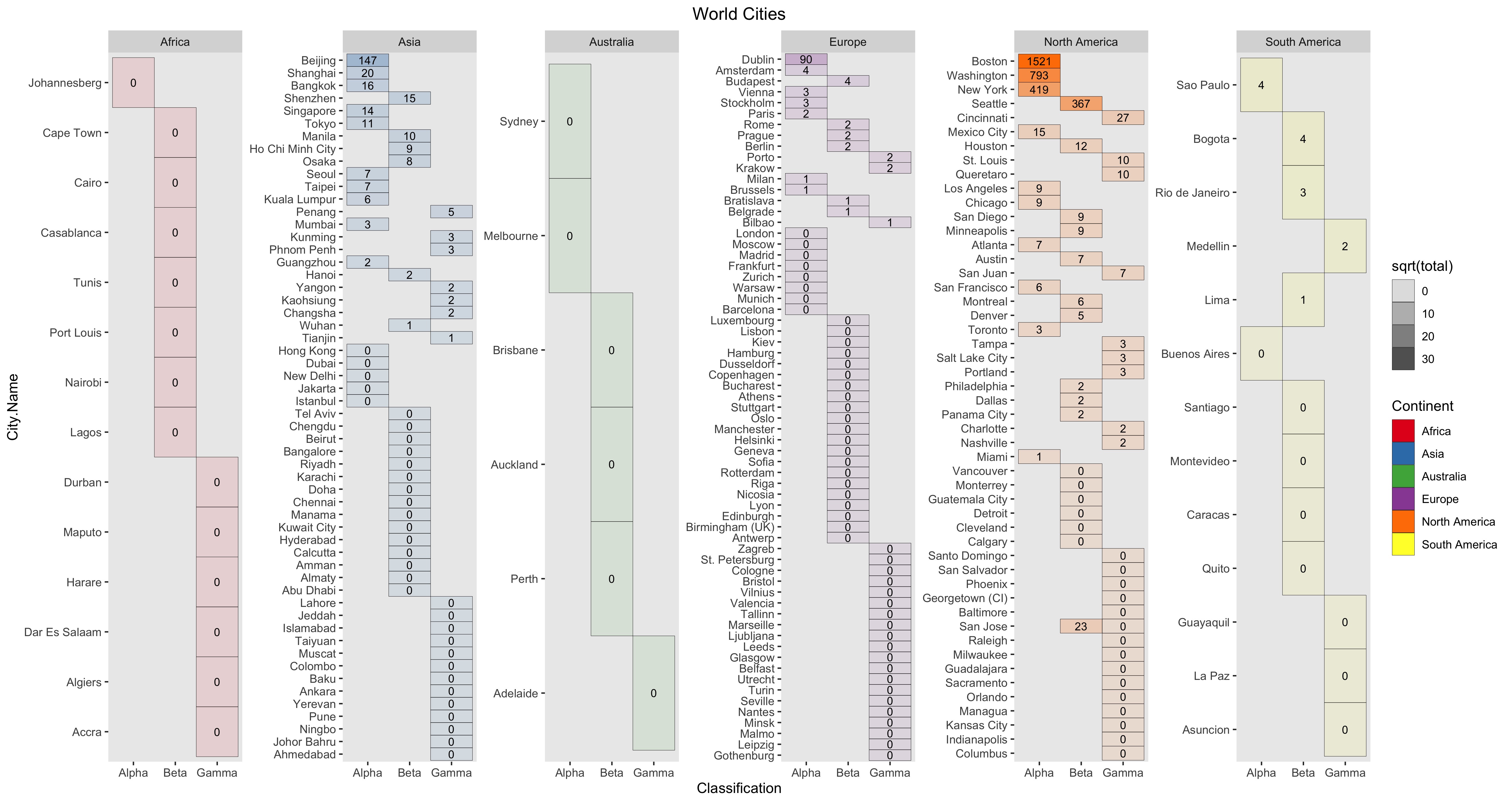
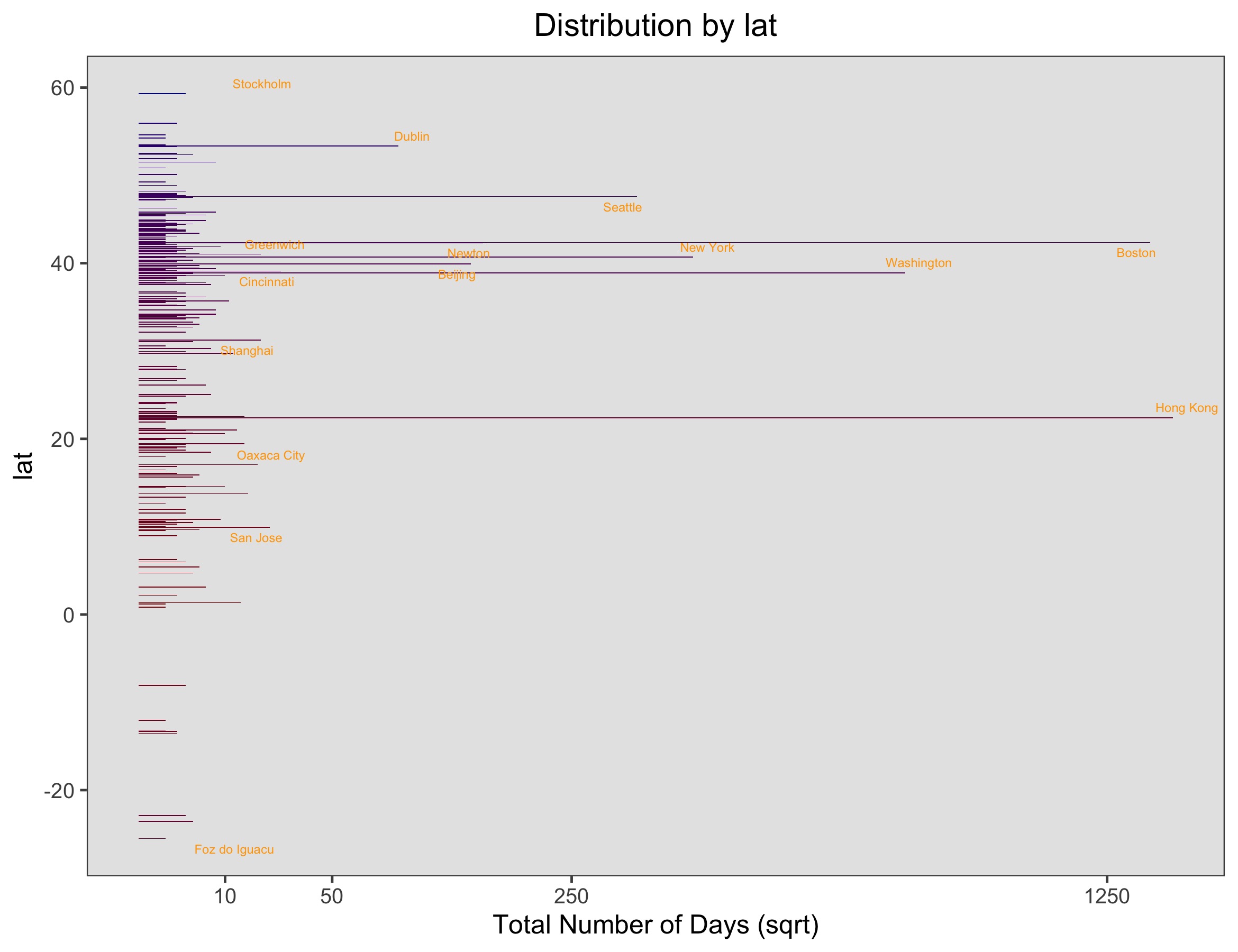
These are the sorts of plots I have prototyped on my own travel data which I have manually maintained:
This graph shows some summary statistics about your library. Your library can be tabulated into fiction and
non-fiction and authors by gender.
Other graphs show the distribution of when the books were written, what the longest ones are, and the most
common genres you've read.
This shows the books that are the least commonly finished in your library.
The percentage represents how many people marked a book as "to read" out of the total number that marked it as "finished".
Popular books that have been published for a while like the Harry Potter series have a read rate of ~95%.
The plot is divided into books that you have finished and those that you have not (if your export includes books you have marked as "to-read").
Popular books that have been published for a while like the Harry Potter series have a read rate of ~95%.
The plot is divided into books that you have finished and those that you have not (if your export includes books you have marked as "to-read").
This plot calculates the geographic mean for each year, and then the distance for all my locations from that mean and plots that on the y axis.
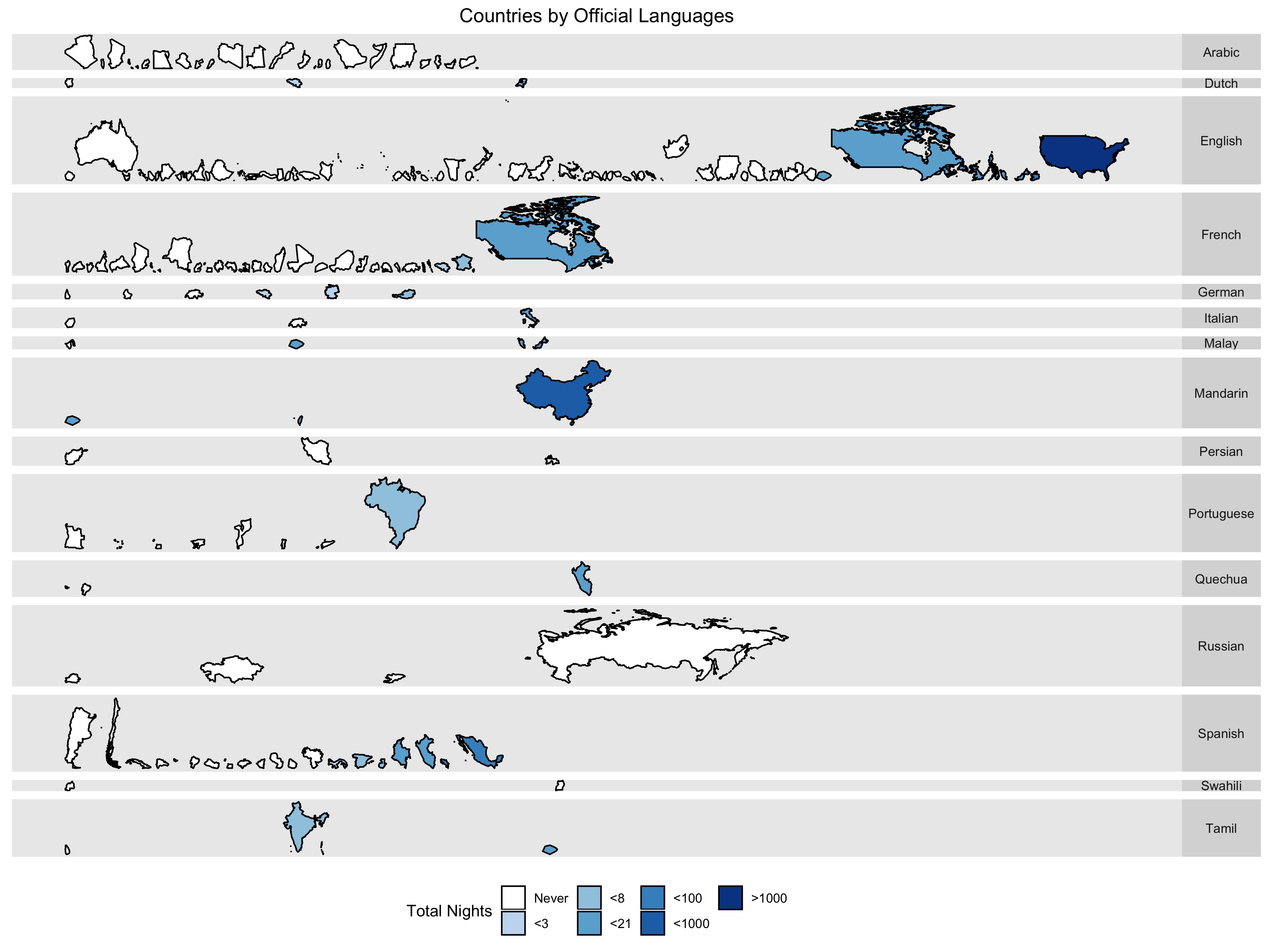
This graph shows the countries you have been to grouped by the official language of the country.